14
Fullscreen Typography
Earlier I mentioned using big oversized photographs in the background of website layouts. This trend can be extended to focus on typography as well: designing your webpage text so it fills the entirety of the browser. Some users may find this annoying. But this is not often the case if the layout is fitted perfectly for super-large text.
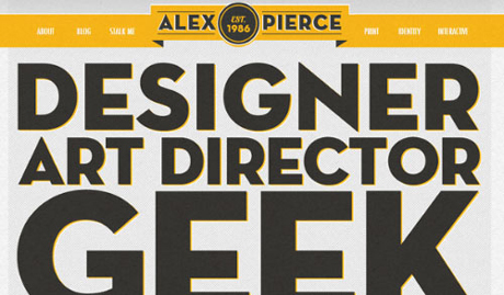
Alex Pierce has a great website layout which does focus deeply on typography. You can see this includes rich text effects using CSS3 properties. Additionally the website is very easy to navigate, and many of the other page elements appear oversized as well.
Big text with unique font styles can stand out just as much as oversized photography. And I am sure this will see more design critiques moving into the new year.
Recommended Reading: Showcase Of Web Designs With Beautiful Typography
