2
Retina Support
Along with responsive support for website layouts I have also seen a dramatic rise in people building for retina devices. Apple first engineered this idea with the iPhone 4 and has since applied this screen display onto their other devices, including the iPad and some MacBooks.
Retina screens are basically twice as dense as any average LCD. So they are the same number of physical pixels, but digitally twice as many pixels can be fitted into the same physical space.
This means pixel-perfect web designers supporting retina devices will need to create two sets of images. First you need to sample your image at double the resolution, then save a “standard” version at half the size. The larger image will be scaled down to the standard resolution and will look very crisp on retina screens.
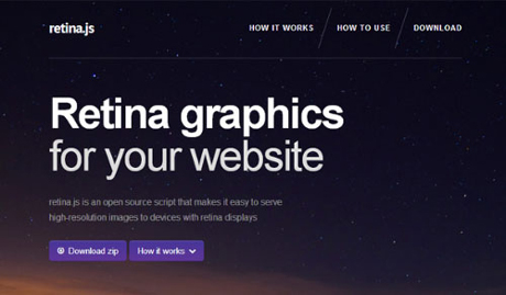
One of my favorite tools for responsive web design is retina.js. This is a JavaScript library for automatically displaying @2x retina copies of image whenever your user is browsing on a retina device.
Although this won’t detect CSS background image, it is still the most handy resource as opposed to coding everything in media queries.