20
Circular Design Elements
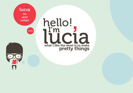
The trend of circles within website layouts is something newer and has been given a lot of attention recently. Designers like circles because they are clean, neat, and generally fit into any layout block. You can build patterns and even fix your page elements into circular designs (eg. user avatars, share buttons, post dates, etc).
The portfolio of Lucia Soto is basically one terrific example of circular web design. The website is built dynamically so you are panning horizontally to different segments in the page. You will notice some cute vector artwork dotted along the sidelines as well. Web designers crave these extra tidbits in page layouts because they ooze uniqueness.
You can find a similar example on the homepage for Site Optimizer which uses circular page elements as informative selling points for their services.
Final Thoughts
User interface design is one of the most complex topics when building digital products. This rings especially true for website layouts, trying to match navigations and content styles for a successful user experience. These design trends aim to point designers in the right direction.
I hope you may consider some of these ideas and think about how they do affect modern day websites. You can find examples of these emerging trends, in smaller businesses to global companies and all other websites in-between. If you are thinking ahead of the curve and want to share some insight on design trends in 2013, just drop a comment in our post discussion area.
