6
Minimalist Landing Pages
Anybody who has spent some time researching markets will understand that selling on the Internet is just plain smart. You have access to a large consumer base from anywhere in the world. Additionally you can sell products which are not even physical, such as videos or creative resources.
Creating a landing page online is all about capturing new leads for your product or service. New trends are following the idea of minimalism: keep everything simple and focus on your core product.
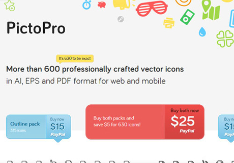
This is exemplified on the PictoPro webpage which offers a beautiful resource for cheap icons. The page is fairly crafty using vector icons as a background effect. But all the text is easy to read and it’s basically a one-click checkout process. You cannot get much simpler than that.
Recommended Reading: Beautiful Landing Pages: Tips And Examples
