13
Mobile Navigation Toggle
When speaking of responsive design one of the most difficult questions is how to build a solid navigation. You want to give your readers direct access to all your important links, without flooding the page making it unreadable. It is also a good idea to keep your responsive navigation hidden away until it’s needed.
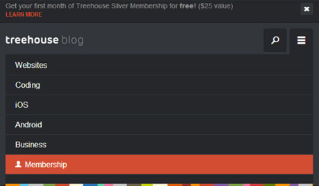
Enter this beautiful design trend of mobile navigation toggle menus. The Treehouse Blog is merely one example of this technique which looks brilliant on your smartphone. And even in your web browser! But there are dozens of websites and design studios who have adopted this trend for their own responsive layouts.
What I like most about the toggled navigation is that you can design menus in so many various forms. You can have links drop down from the top, or slide down, or push content over from the left or right side. Designers have so many options to play with and there is plenty of time for UI experiments.
Read Also: Mobile App Design/Dev: Building Navigation With JQuery